
Global Energy Consumption by Source, and Carbon Emissions for last 120 years
News from Web 11-Mar-2023
Where does our energy come from, and how has this mix changed over the last 100 years?
These charts from Truman Du examine the complex relationship between energy production, consumption, and related carbon emissions using information from Our World in Data.
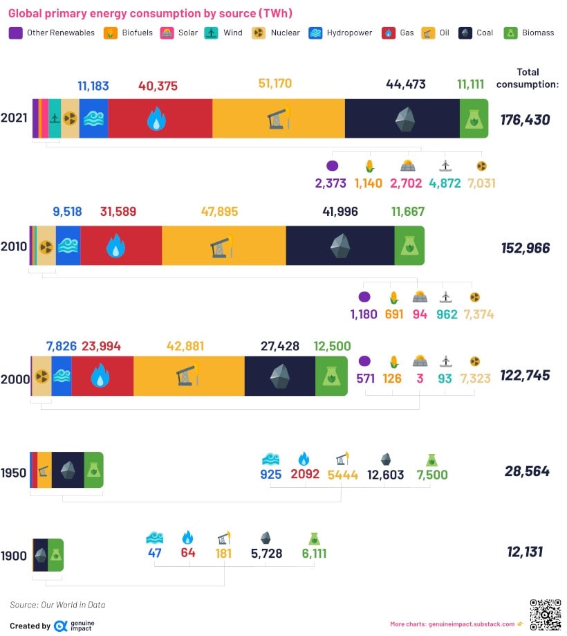
The World’s Energy Mix (1900-2021)
In the last 10 years, total global energy consumption has risen nearly 15%. Before that, between 2000 and 2010, it increased by nearly 25%.
And despite frequent headlines about green initiatives over the last few years, fossil fuels continue to account for the majority of total energy consumption.
In 2021, 77% of global energy was sourced from coal, oil, and gas.
Even so, renewable energy sources like wind, solar, and hydro have gained traction since the year 2000. Hydropower was the biggest renewable energy source in 2021, accounting for 6.3% of total energy consumed.
A Fossil Fuel Heavy Mix
Taking a closer look at the breakdown of energy by source, another strong (if slightly counterintuitive) trend appears to be holding its own.
Coal has remained a key source of the world’s energy consumption since 1900. Despite its relative share decreasing over time, as of 2021, coal remains the second biggest energy source, accounting for 25% of the world’s energy needs. All figures below are in TWh (terrawatt-hours).
| Global Energy Consumption | 1900 | 1950 | 2000 | 2010 | 2021 |
| Solar | - | - | 3 TWh | 94 TWh | 2,702 TWh |
| Wind | - | - | 93 TWh | 962 TWh | 4,872 TWh |
| Nuclear | - | - | 7,323 TWh | 7,374 TWh | 7,031 TWh |
| Hydro | 47 TWh | 925 TWh | 7,826 TWh | 9,518 TWh | 11,183 TWh |
| Gas | 64 TWh | 2,092 TWh | 23,994 TWh | 31,589 TWh | 40,375 TWh |
| Oil | 181 TWh | 5,444 TWh | 42,881 TWh | 47,895 TWh | 51,170 TWh |
| Coal | 5,728 TWh | 12,603 TWh | 27,428 TWh | 41,996 TWh | 44,473 TWh |
| Total | 12,131 TWh | 28,564 TWh | 122,745 TWh | 152,966 TWh | 176,431 TWh |
From its crucial role in the Industrial Revolution, to its relative cheapness and useful byproducts, coal isn’t close to being phased out anytime soon. In fact, it has seen a resurgence in powering India and China’s growing economies in the 21st century.
As fossil fuel use has increased in absolute terms, so have carbon emissions.
Carbon Emissions in 1900 vs. 2020
China, the U.S., India, Russia, and Japan are the top five emitters in the world, responsible for 60% of the world’s total emissions in 2020.
As these countries include the world’s largest economic powers, some believe emissions are a necessary byproduct of economic growth. Though there are exceptions, this seems to have held true on average, as studies show a 1% change in GDP is correlated with a 0.072 change in carbon dioxide emissions.
When looking at the chart of carbon emissions below, China’s journey of economic growth in the latter half of the 20th century exemplifies this.
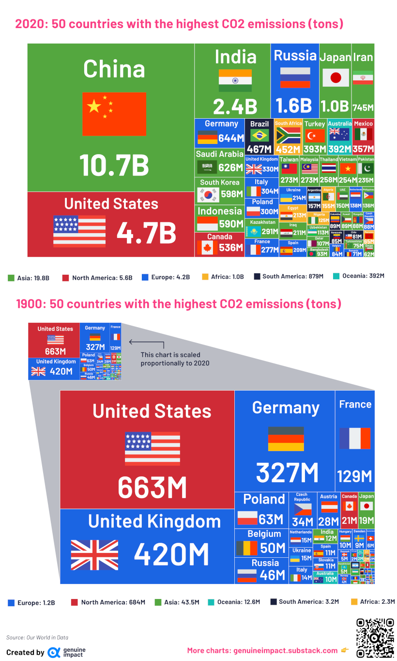
China’s emissions increased dramatically, rising by six times from 1978 to 2018 alone, driven primarily by economic growth.
Here’s a breakdown of the top 50 biggest emitters in the world in 2020 versus 1900. All figures are in units of 100 million tons, and are rounded for simplicity.
| Rank | Country | 1900 Emissions | Country | 2020 Emissions |
| 1 | U.S. | 6.6 | China | 106.7 |
| 2 | U.K | 4.2 | U.S. | 47.1 |
| 3 | Germany | 3.3 | India | 24.4 |
| 4 | France | 1.3 | Russia | 15.8 |
| 5 | Poland | 0.6 | Japan | 10.3 |
| 6 | Belgium | 0.5 | Iran | 7.5 |
| 7 | Russia | 0.5 | Germany | 6.4 |
| 8 | Czechia | 0.3 | Saudi Arabia | 6.3 |
| 9 | Austria | 0.3 | South Korea | 6 |
| 10 | Canada | 0.2 | Indonesia | 5.9 |
| Total | World | 19.5 | World | 319.2 |
The data also highlights the shift in the global economy between developed and developing economies.
In the 1900s, the largest emitters were the U.S. and other industrialized nations. In the later data set, developing economies like India, Brazil, and Indonesia have moved up the list as more significant carbon emitters as well.
Exporting Emissions
The accounting for carbon emissions can change with international trade, depending on how emissions are counted and attributed.
Should emissions generated from a manufactured good be assigned to the country where the good was made, or to the place where the good was ultimately consumed? Adjusting emissions based on imports and exports can help us look at these differences.
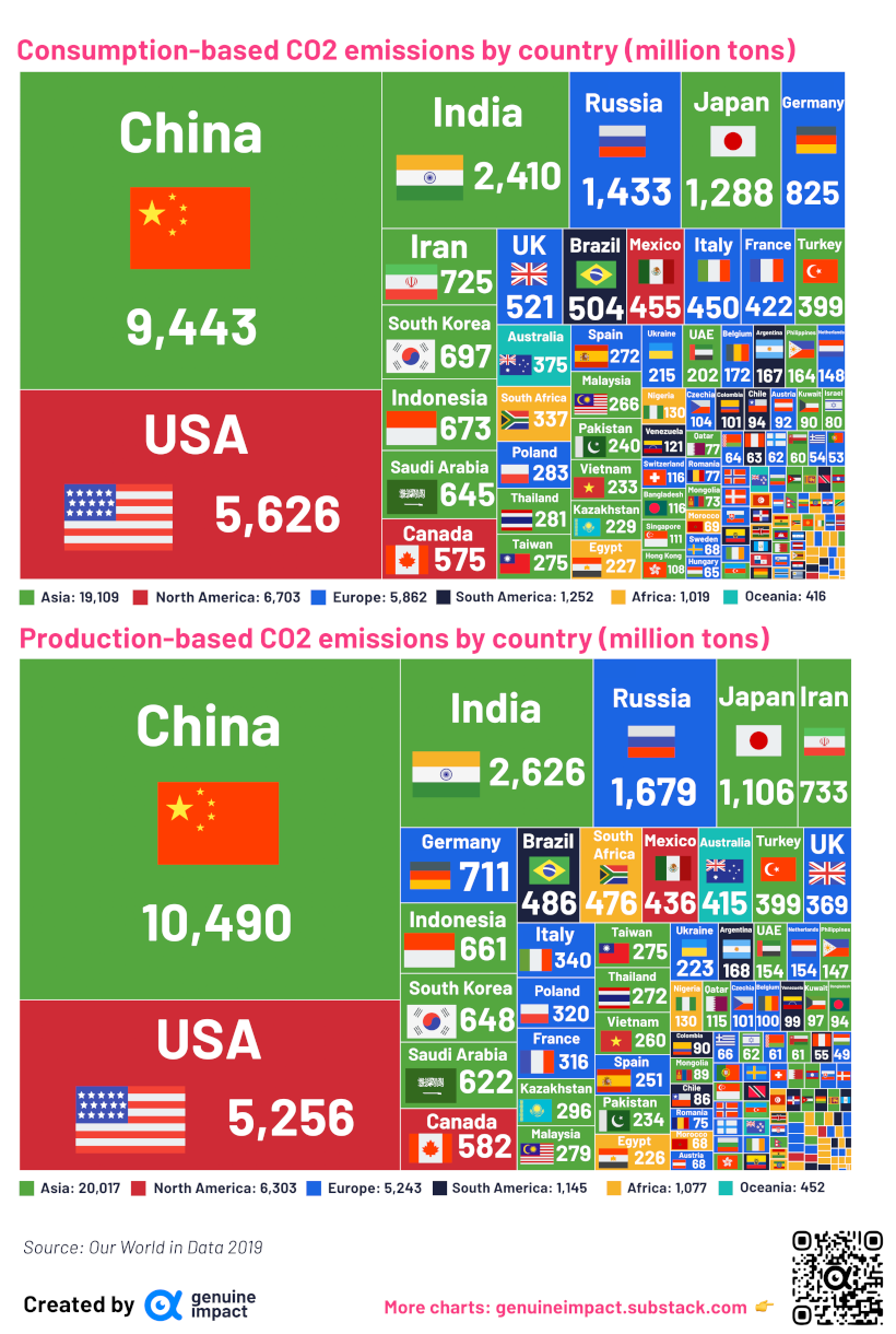
Richer economies that import lots of goods, like the U.S., UK, or Germany tend to have higher consumption-based emissions.
Meanwhile, for high-growth countries like China, India, Iran, and South Africa, the inverse is true: their production-based emissions are higher than their consumption-based emissions.
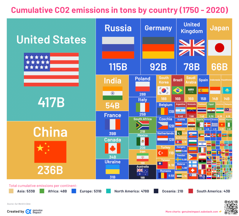
Cumulative Carbon Emissions
When taking into account emissions from the Industrial Revolution to 2020, nearly every continent has contributed large amounts of carbon emissions—but key leaders emerge.
Here is the full breakdown:
According to the UN, the world will need to cut emissions by 32 Gt more than what countries have already promised in order to achieve the 1.5 °C target outlined in the Paris Agreement.
As you can see in this data, how or if this happens will likely be driven largely by the future of our energy sources and consumption.

More News
Sustainability in Supply Chain Management: A Comprehensive Guide
This comprehensive guide explores how sustainability is transforming supply chai...
05-Dec-2025
EU Simplifies Carbon Border Adjustment Mechanism (CBAM)
The European Union has approved new rules to simplify the Carbon Border Adjustme...
05-Nov-2025
Understanding Sustainability Roadmap: Aligning Purpose, Performance and Profitability
A sustainability roadmap enables organisations to align purpose, performance, an...
04-Nov-2025
The Untapped Risk of Water Management in Sustainability
Water risk is rapidly becoming a material financial issue, with growing exposure...
31-Oct-2025
Cement and Concrete in Net Zero
A global shift is underway in the path to net zero — from pledge-based allianc...
29-Oct-2025